100 Meters EDA
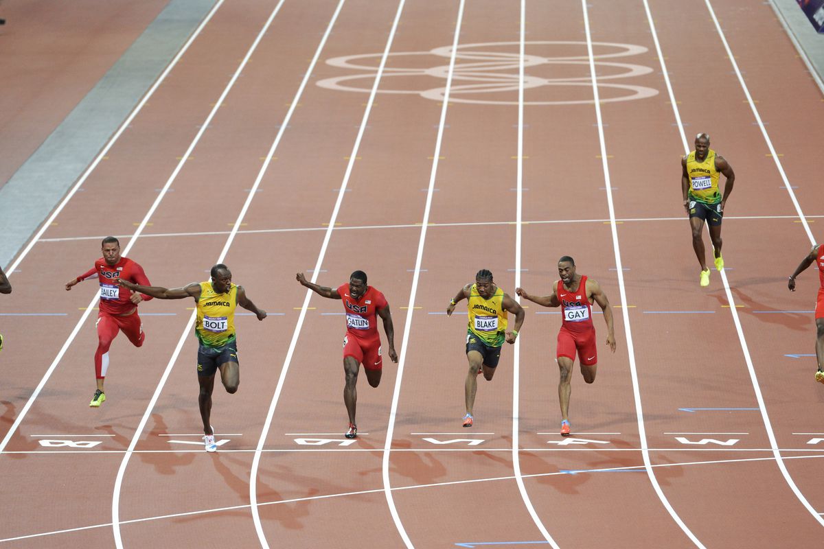
In the spirit of the upcoming Paris Olympics 2024, let us deep dive into the most anticipated competition, the 100m sprint. We aim to pull in relevant data, clean this data, visualize relevant parts of the data, and then predict the competition.
First, we import the necessary Python libraries for our analysis.
// Adding Pandas and Numpy libraries
import pandas as pd
import numpy as np
Then we pull in the data. We get our data from the Wikipedia page on the 100m race. The link to the data is 100-meters records. We use the “read_html()” built-in Pandas function. This function outputs a list. It takes all the “table” tags in the webpage and outputs all of them as a list.
// Pulling in the data from the webpage
df = pd.read_html("https://en.wikipedia.org/wiki/100_metres")
The data on the best performances for each year are found at the fifth and sixth indices of the list. These are for the men’s and women’s best performances respectively.
// Assigning the men's record to mens_best
mens_best = df[5]
// Assigning the women's record to womens_best
womens_best = df[6]
Then we inspect the attributes of the data with “info()”, “head()”, “shape” and “describe()”.
// Basic inspection of mens_best dataset
mens_best.shape

mens_best.head()

mens_best.info()

// Basic inspection of womens_best dataset
mens_best.shape

mens_best.head()

mens_best.info()
All of the columns in the dataset are relevant so we do not drop any.
We then check the data types of the columns, we see that the “Time” column is an object and there are some cells with string letters or other values attached to the float values. “Regex” formatting is used to replace the string values with an empty value.
// Fixing the mens Time column, from object to float
mens_best["Time"] = mens_best["Time"].str.replace(r'[^0-9.]', '', regex=True).astype(float)

// Fixing the womens Time column, from object to float
womens_best["Time"] = womens_best["Time"].str.replace(r'[^0-9.]', '', regex=True).astype(float)
We also use “Regex” formatting to extract the country value from the “Athlete” column. We consider the string values before the opening parentheses and the string before the closing parentheses in the code.
// Separating the athlete name and the athlete country
mens_best[["Athlete", "Country"]] = mens_best["Athlete"].str.extract(r'([^\(]+)\s\(([^)]+)\)')

womens_best[["Athlete", "Country"]] = womens_best["Athlete"].str.extract(r'([^\(]+)\s\(([^)]+)\)')
Column names are fine so we move on to check missing values in the dataframe. There are no missing values so on to the next step.
// Checking missing values for the men and women datasets
mens_best.isna().sum()

womens_best.isna().sum()
After we check for duplicated rows in the dataset and there isn’t any.
// Checking for duplicated rows in both datasets
mens_best.duplicated()

womens_best.duplicated()
However, there are duplicates for some year values in the “Year” column. Upon close inspection, we see that they are not necessarily duplicated. They are duplicates because the athletes in these rows run the same time in the same year, hence the duplication.
// Checking for duplicated rows with the Year column for both datasets
mens_best.loc[mens_best["Year"].duplicated()]

womens_best.loc[womens_best["Year"].duplicated()]
We move to univariate data visualizations. Starting with importing “matplotlib.pyplot” and “seaborn” libraries. We also use “ggplot” style for “matplotlib” and we add the “color_palette” of “seaborn”.
// Importing Matplotlib and Seaborn
import matplotlib.pyplot as plt
plt.style.use("ggplot")
import seaborn as sns
color_pal = sns.color_palette()
Let’s create a new column adding the “Year” and “Athlete” columns then use “value_counts()” function to plot a horizontal bar chart for the “mens_best” and “womens_best” dataframes.
// New Name column for men
mens_best["Name"] = mens_best["Year"].astype(str) + ": " + mens_best["Athlete"]

// New Name column for women
womens_best["Name"] = womens_best["Year"].astype(str) + ": " + womens_best["Athlete"]

// Side-by-side horizontal barchart plots for men and women
fig, axs = plt.subplots(1, 2, figsize=(10, 10))
mens_best.sort_values("Year", ascending=False).set_index("Name")["Time"].plot(kind="barh", ax=axs[0])
ax=axs[0].set_xlim(9.4, 10.2)
ax=axs[0].set_title("Mens 100m Dash Best Performances by Year")

womens_best.sort_values("Year", ascending=False).set_index("Name")["Time"].plot(kind="barh", ax=axs[1], color=color_pal[1])
ax=axs[1].set_xlim(10.2, 11.4)
ax=axs[1].set_title("Womens 100m Dash Best Performances by Year")
plt.tight_layout()

plt.show()
A simple time distribution is visualized using a histogram plot for both genders. We observe that most of the athletes recorded a time ranging from 9.75 to 9.95 for the males and 10.75 to 10.85 for females.
// Histogram of Time distribution for both men and women
plt.figure(figsize=(10, 6))
plt.hist(mens_best["Time"], bins=30)
plt.xlabel("Time")
plt.ylabel("Frequency")
plt.title("Distribution of Men's 100m Best Time")
plt.show()

plt.figure(figsize=(10, 6))
plt.hist(womens_best["Time"], bins=30)
plt.xlabel("Time")
plt.ylabel("Frequency")
plt.title("Distribution of Women's 100m Best Time")
plt.show()
Next, a bar chart displaying the frequency of best sprinters recorded by the country for both genders. The USA dwarfs all other countries for the male category while Jamaica closely followed the USA in the female department.
// Barchart for men and women by country
plt.figure(figsize=(10, 6))
mens_best["Country"].value_counts().plot(kind="bar")
plt.title("Best Male Sprinters by Country")
plt.ylabel("Frequency")
plt.show()

plt.figure(figsize=(10, 6))
womens_best["Country"].value_counts().plot(kind="bar")
plt.title("Best Female Sprinters by Country")
plt.ylabel("Frequency")
plt.show()
Then we plot a boxplot for both sexes with the “Time” column of the dataset.
// Boxplot of Time column for men and women
plt.figure(figsize=(10, 6))
plt.boxplot(mens_best["Time"])
plt.show()

plt.figure(figsize=(10, 6))
plt.boxplot(womens_best["Time"])
plt.show()
In bivariate analysis and visualization, we start with a scatterplot for “Year” on the x-axis and “Time” on the y-axis. We see a significant downward slope for the men and a fair downward slope for the women. We are adding “Country” as the hue gives more insight into the visualization. The visual shows us that Jamaican male sprinters were dominant between 2005 and 2013 while American athletes have taken over for the past decade.
// Scatterplot of Time and Year relationship categorized by Country
plt.figure(figsize=(10, 6))
scatter_plot = sns.scatterplot(data=mens_best, x="Year", y="Time", palette="muted", legend="full", hue="Country")
plt.title("Correlation Between Year and Best Time Recorded in Men's 100m by Country")
plt.xlabel("Year")
plt.ylabel("Time")
plt.show()

plt.figure(figsize=(10, 6))
scatter_plot = sns.scatterplot(data=womens_best, x="Year", y="Time", palette="muted", legend="full", hue="Country")
plt.title("Correlation Between Year and Best Time Recorded in Women's 100m by Country")
plt.xlabel("Year")
plt.ylabel("Time")
plt.show()
Also, the heatmap visual of “Year” and “Time” showed that the athlete ran faster as the years passed. Men recorded a 0.82 and women 0.67.
// Heatmap of correlation between Time and Year for men and women
mens_corr = mens_best[["Year", "Time"]].corr()
plt.figure(figsize=(5, 5))
heat_map = sns.heatmap(data=mens_corr, annot=True, cmap="coolwarm", center=0)
plt.title("Correlation Between Year and Men's Best Time")
plt.show()

womens_corr = womens_best[["Year", "Time"]].corr()
plt.figure(figsize=(5, 5))
heat_map = sns.heatmap(data=womens_corr, annot=True, cmap="coolwarm", center=0)
plt.title("Correlation Between Year and Women's Best Time")
plt.show()
Further analysis using pivot tables showed Jamaican athletes recording the best average time followed by Great Britain for males and Jamaican again topping the female category.
// Pivot table of Time by Country according to Min, Mean and Max for men and women
pivot_table_men = mens_best.pivot_table(values='Time', index='Country', aggfunc=['min', 'mean', 'max'])
pivot_table_men

pivot_table_women = womens_best.pivot_table(values="Time", index="Country", aggfunc=["min", "mean", "max"])
pivot_table_women
Finally, we answer some basic questions with the data. The first question is which athlete holds the world record for the 100-meter competition (for both genders).
// World record holders for men and women
mens_record = mens_best["Time"].min()
mens_best.query("Time == @mens_record")

womens_record = womens_best["Time"].min()
womens_best.query("Time == @womens_record")
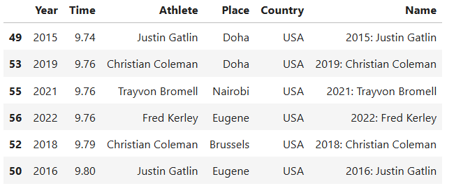
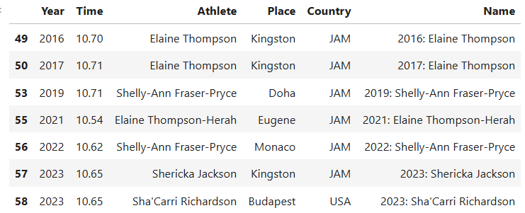
Second, which athletes are most likely to podium in the upcoming Olympics event for the 100-meter competition (again for both genders)?
// Men and women who are most likely to win a medal in the upcoming Olympics
filtered_men = mens_best.query("Year > 2014")
mean_time = filtered_men["Time"].mean()
filtered = filtered_men[filtered_men["Time"] < mean_time].sort_values(by="Time", ascending=True)
filtered

filtered_women = womens_best.query("Year > 2014")
mean_time = filtered_women["Time"].mean()
filtered_ = filtered_women[filtered_women["Time"] < mean_time].sort_values(by="Time", ascending=True)
filtered_
The athletes that are most likely to podium at the 2024 Olympics for 100-meter competition are as follows
This is the Colab link to the code.