Financial Data Analysis On Returns and Volatility
Source: Pixabay.com
This analysis covers how to calculate the returns of security in Python, the volatility of financial assets, and how to measure them. Also, why diversification of assets in a portfolio is good and how to efficiently diversify your financial assets are discussed. Before we get started let's import the necessary libraries and dependencies.
import pandas as pd
import numpy as np
import datetime
import matplotlib.pyplot as plt
import seaborn as sns
import yfinance as yfin
from datetime import date
# pd.options.display.float_format = "{:,.6f}".format
We would need to import data for our analysis. Let's take our data from Yahoo Finance as it is easy to get pull up-to-date data at no cost with Yahoo's yfinance library.
# Let's pull Bitcoin and Ford data for the past five years
start_fbtc = datetime.date.today() - datetime.timedelta(days=365 * 5)
end_fbtc = datetime.date.today()

# We use adjusted close because it adjusts for dividend sharing especially in stocks
prices_fbtc = yfin.download(["BTC-USD", "F"], start_fbtc, end_fbtc)["Adj Close"]
prices_fbtc
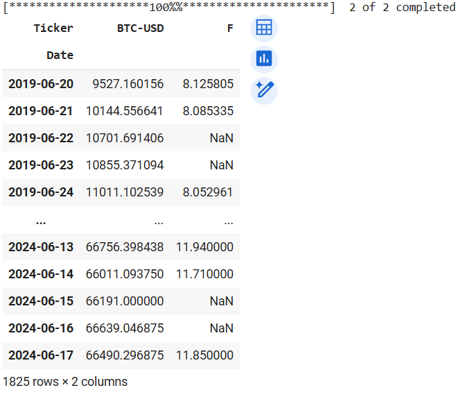
Output of prices_fbtc
We see NaN in the Ford series because Bitcoin trades every day of the week while Ford trades on weekdays only. So, let's drop the NaN values before calculating the percentage change (returns) for each asset.
# Dropna removes all rows with a NaN value
prices_fbtc.dropna(inplace=True)

# pct_change method calculates the percentage for each row in prices_fbtc dataframe
returns_fbtc = prices_fbtc.pct_change()
returns_fbtc.head()
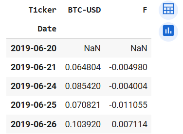
Output of returns_fbtc.head()
Now we see the returns for each asset. The first row has no value because it does not have a previous row to calculate the change in percentage. Now let's check how much we would make if we had invested USD1000 in each financial asset. This is calculated by subtracting the initial price from the final price and dividing the result by the initial price. That would be the percentage change over the five years. Multiplying the result by USD1000 would produce the amount you would receive at the end of the 5-year tenure.
btc_5yr_returns = ((prices_fbtc["BTC-USD"].iloc[-1] - prices_fbtc["BTC-USD"].iloc[0]) / prices_fbtc["BTC-USD"].iloc[0])
f_5yr_returns = ((prices_fbtc["F"].iloc[-1] - prices_fbtc["F"].iloc[0]) / prices_fbtc["F"].iloc[0])
print(f"Bitcoin 5yr Returns: {btc_5yr_returns * 100}")
print(f"Ford 5yr Returns: {f_5yr_returns * 100}")
Bitcoin has pulled in close to 600% returns which is almost USD6000 (597*1000) for a USD1000 investment 5 years ago, while Ford had a 45.8% returns increment. This is not bad for an old-guard stock. Thus you would receive USD1458 today if you invested USD1000 in Ford stocks 5 years ago.
Moving on, let's write a function to make our data pulling and day-to-day percentage change reproducible.
# Writing a function to streamline the data-pulling phase of our work
# start and end parameters signify the start and end times for the data we are collecting
# tickers indicate the ticker names of the financial asset data we want.
# This parameter should be a dictionary for ticker name on Yahoo Finance and the other name would be for renaming the series
def pullDataReturns(start, end, tickers):
    prices = yfin.download(list(tickers.keys()), start, end)["Adj Close"]
    prices = prices.rename(columns=tickers)
    prices.dropna(inplace=True)
    # Rearranging columns by the ticker dictionary
    prices = prices[list(tickers.values())]
    returns = prices.pct_change()
    return returns, prices
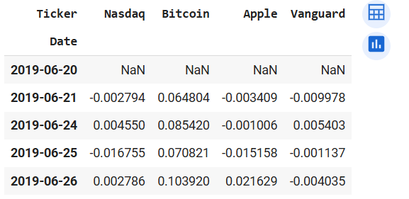
With this function, we can easily pull in data. Let's get data from different types of financial assets so we can compare their average returns, standard deviation (volatility), and variance. We choose Nasdaq (a market index), Bitcoin (a cryptocurrency), Apple (an income stock) and Vanguard long-term bond exchange-traded fund (an ETF).
start = datetime.date.today() - datetime.timedelta(days=365 * 5)
end = datetime.date.today()
tickers_1 = {"NQ=F": "Nasdaq", "BTC-USD": "Bitcoin", "AAPL": "Apple", "BLV": "Vanguard"}
returns_1, prices_1 = pullDataReturns(start, end, tickers_1)
returns_1.head()
prices_1.head()
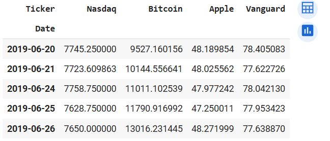
Output of returns_1.head() (left) and prices_1.head() (right)
Let's write another function that calculates the returns from the financial assets in "prices_1" and also gives us the total of returns and principal after the stated time period.
# totalReturns function that calculates the returns percentage, returns and the principal plus the returns
def totalReturns(df, amount):
    # Initialize lists to store the returns and return amounts
    returns_percentages = []
    returns_amounts = []
    ret_principal = []

    # Loop through each column (stock) in the DataFrame
    for col in df.columns:
        # Calculate the return for the stock
        initial_price = df[col].iloc[0]
        final_price = df[col].iloc[-1]
        ret = (final_price - initial_price) / initial_price

        # Calculate the return amount for the stock
        ret_amt = ret * amount

        # Append the returns and return amounts to the lists
        returns_percentages.append(round(ret * 100, 2))
        returns_amounts.append(round(ret_amt, 2))
        ret_principal.append(round(ret_amt + amount, 2))

    # Create a DataFrame with the calculated returns and return amounts
    data = {
        "Returns Percentage": returns_percentages,
        "Returns Amount": returns_amounts,
        "Principal Plus Amount": ret_principal
    }
    ret_df = pd.DataFrame(data, index=df.columns)

    return ret_df
# Calling the totalReturns functions with prices_1 as an argument
totalReturns(prices_1, 1000)
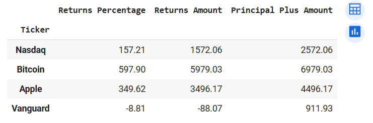
Output of totalReturns(prices_1, 1000)
We see that Bitcoin is still the most profitable and Vanguard ETF made a loss over the five year period.
Let's check the mean daily returns of each asset, the volatility (standard deviation), the covariance and lastly the correlation of these assets.
returns_1.mean() * 100
returns_1.std()
returns_1.corr().round(3)
returns_1.cov()
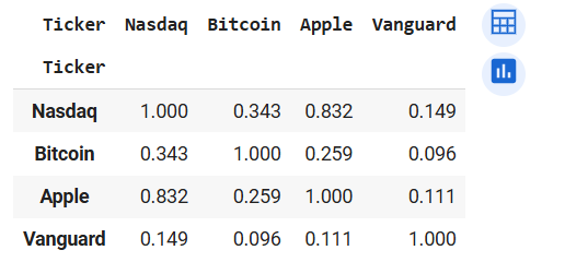
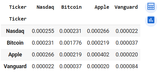
Output of returns_1.corr() (left) and returns_1.cov() (right)
Displaying the correlation coefficients of the assets on a heatmap
# Plotting Pearson's correlation coefficients of the assets in returns_1 on a heatmap
corr_1 = returns_1.corr().round(3)
sns.heatmap(corr_1, annot=True, cmap='RdBu', linewidths=.5)
plt.title("Correlation of Securities")
plt.show()
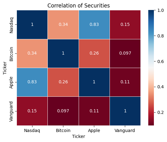
Heatmap of returns_1.corr()
We see that Apple is strongly correlated with Nasdaq. This is no surprise because Apple is listed Nasdaq. While the Vanguard bond ETF has the weakest correlation coefficients with all other assets. Let's given that Bitcoin has the highest volatility (from returns_1.mean()), let's check if investing in such a risky financial asset is worth the risk. We measure the risk against returns with the Sharpe Ratio. Sharpe Ratio adjusts returns with the risk associated with the asset. Sharpe Ratio = (Expected Returns - Risk-free Rate) / Standard Deviation
# Assuming risk-free rate of 0
sharpe_ratio = returns_1.mean() / returns_1.std()
sharpe_ratio * 100
From the data, we observe that Apple gives us the highest adjusted-risk returns of 6.97% followed by Bitcoin (5.82%) and coming in last is Vanguard (-0.34%) Let's create another function to make the volatility, average daily returns and Sharpe Ratio calculation reproducible.
# Function for performance comparison
def comparePerformance(df):
    # Initialising empty lists for our values
    ret_mean = []
    ret_std = []
    ret_sharp = []

    # Looping through all the stocks in the dataframe
    for col in df.columns:
        mean = df[col].mean() * 100
        std = df[col].std()
        sharpe = df[col].mean() / df[col].std()

        # Appending values to the empty lists
        ret_mean.append(round(mean, 3))
        ret_std.append(round(std, 3))
        ret_sharp.append(round(sharpe, 3))

    # Creating a dictionary with the data
    data = {
        "Average Daily Returns Percentage": ret_mean,
        "Asset Volatility": ret_std,
        "Asset Sharpe Ratio": ret_sharp
    }

    # Creation dataframe with the dictionary
    results = pd.DataFrame(data, index=df.columns)

    return results
comparePerformance(returns_1)
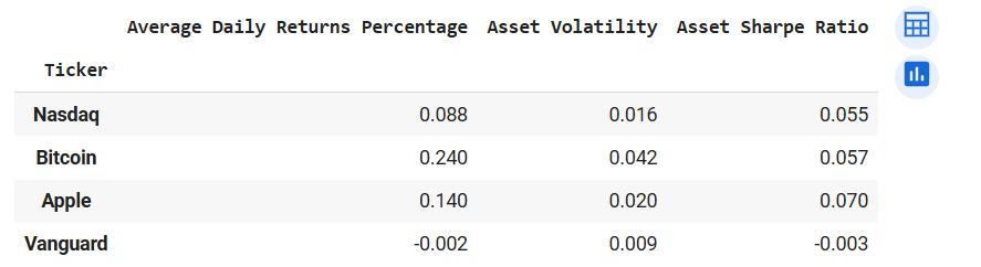
Output of comparePerformance(returns_1)
We have seen the performance of each security, now let us create a portfolio with the stated assets to diversify our portfolio. We will be comparing the performance of the portfolio with each asset to see if diversification creates better returns and also lowers our risk (volatility). First, we assume some weights for our assets in the portfolio. The weights tell us how much emphasis we would be putting on each security. For now lets give each asset an equal weight of 0.25.
# Creation of the portfolio
weights_1 = [0.25, 0.25, 0.25, 0.25]
returns_1["Portfolio"] = (returns_1 * weights_1).sum(axis=1)
returns_1.head()
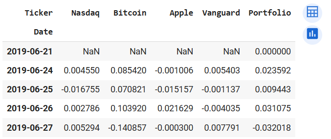
Output of returns_1.head() after porfolio creation
Let's assume a USD10000 investment in each security and portfolio separately. We do this to analyze the performance of the portfolio against that of the securities. To do that we first add 1 to each value in the dataframe then replace the values in the first row with 10000. After we would use the "cumprod()" method to calculate the cumulative returns of the investment of each asset.
returns_port = returns_1 + 1
returns_port.iloc[0] = 10000
returns_port = returns_port.cumprod()
returns_port.head()
returns_port.tail()
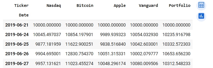
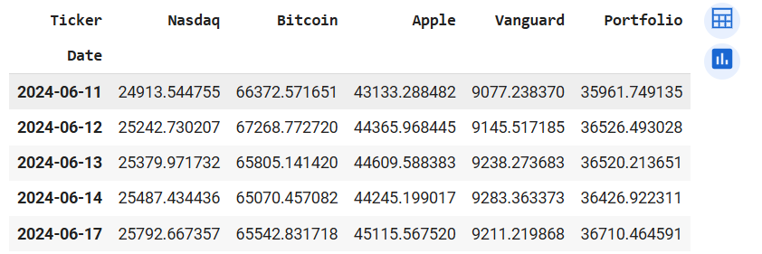
Output of returns_port.head() (left) and returns_port.tail() (right)
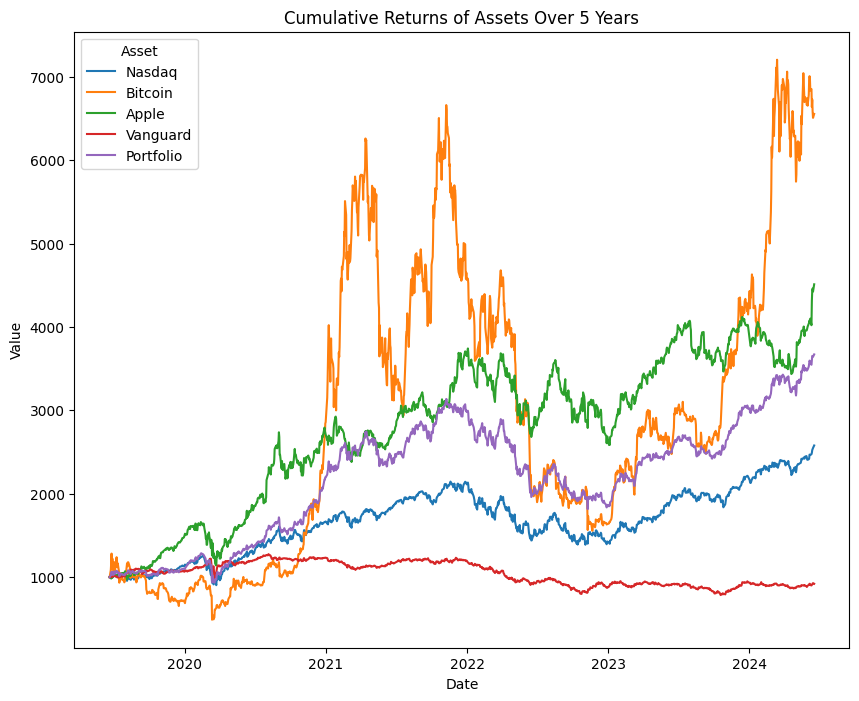
At first glance, we see that the portfolio did better than Nasdaq, and Vanguard but not Bitcoin or Apple. Let's plot the cumulated returns for all the assets on a lineplot to visually inspect the performance of the portfolio. To do that, we need to change the returns_port dataframe from wide to long. That can be achieved with the melt() method.
# Making the date index a new column
returns_port["Date"] = returns_port.index

# Changing the returns_port dataframe from wide to long
returns_port = returns_port.melt(id_vars=["Date"], var_name="Asset", value_name="Value")
returns_port.head()
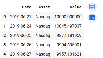
Output of returns_port.head() after using melt() method
# Plotting the assets in returns_port on a lineplot
plt.figure(figsize=(10, 8))
sns.lineplot(data=returns_port, x="Date", y="Value", hue="Asset")
plt.title("Cumulative Returns of Assets Over 5 Years")
plt.show()
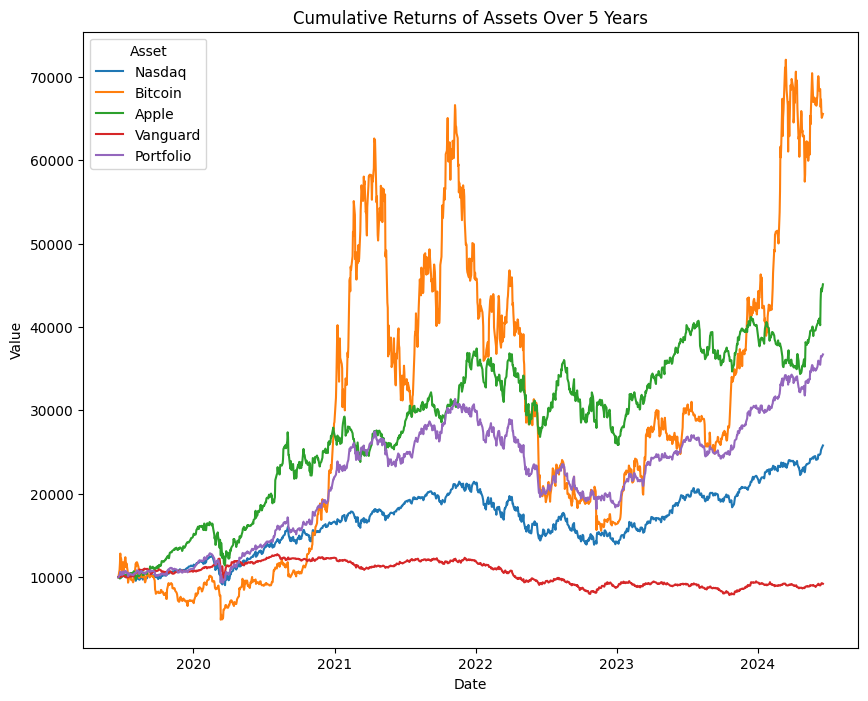
Lineplot of returns_port dataframe
With the visual representation of the performance we see how well the portfolio has performed over the 5 year period. Let us check if it has good volatility and Sharpe Ratio measure given it's performance. We would go back to the returns_1 dataframe for this exploration.
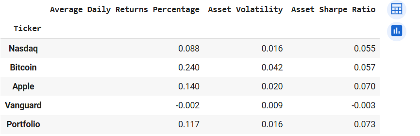
comparePerformance(returns_1)
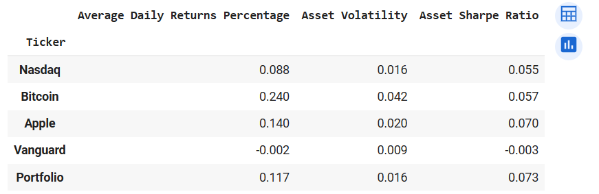
Output of comparePerformance(returns_1)
We see that the average daily return of the portfolio is higher than Nasdaq's but the volatility measures are equal. Also, the Sharpe Ratio of the portfolio is the highest among all the assets. This shows the power of diversification. The efficient use of diversification can increase the performance of your portfolio. The rule of thumb is to select securities that have weak or fair correlation coefficients. Also, reducing the weight of highly volatile assets reduces the portfolio's volatility and increases its performance. Again let us create a function to effectively reproduce this work for any combination of securities and the portfolio.
# Funciton to plot the performance of assets and the portfolio
# weights parameter would be a list of the weights of the securities in the portfolio by order of the tickers dictionary
# amount is the amount to be invested in each security and the portfolio
def plotSecurities(start, end, tickers, weights, amount):
    # Using the pullDataReturns function to pull returns data
    returns, prices = pullDataReturns(start, end, tickers)

    # Convert weights to a numpy array
    weights = np.array(weights)

    # Check if the length of weights matches the number of tickers
    if len(weights) != len(tickers):
        raise ValueError("The length of weights must match the number of tickers.")

    # Creating portfolio columns with weights
    weighted_returns = returns * weights
    returns["Portfolio"] = weighted_returns.sum(axis=1)

    # Creating the cumulative data with amount
    returns_port = returns + 1
    returns_port.iloc[0] = amount
    returns_port = returns_port.cumprod()

    # Making the date index a new column
    returns_port["Date"] = returns_port.index

    # Changing the returns_port dataframe from wide to long
    returns_port = returns_port.melt(id_vars=["Date"], var_name="Asset", value_name="Value")

    # Plotting the assets in returns_port on a lineplot
    plt.figure(figsize=(10, 8))
    sns.lineplot(data=returns_port, x="Date", y="Value", hue="Asset")
    plt.title("Cumulative Returns of Assets Over 5 Years")

    return plt.show()
start = datetime.date.today() - datetime.timedelta(days=365 * 5)
end = datetime.date.today()
tickers_1 = {"NQ=F": "Nasdaq", "BTC-USD": "Bitcoin", "AAPL": "Apple", "BLV": "Vanguard"}
weights_1 = [0.25, 0.25, 0.25, 0.25]
plotSecurities(start, end, tickers_1, weights_1, 1000)
Output of plotSecurities(start, end, tickers_1, weights_1, 1000)
# This function would be similar to comparePerformance but we would be adding the portfolio to the analysis
def comparePerfPort(start, end, tickers, weights):
    # Using the pullDataReturns function to pull returns data
    returns, prices = pullDataReturns(start, end, tickers)

    # Convert weights to a numpy array
    weights = np.array(weights)

    # Check if the length of weights matches the number of tickers
    if len(weights) != len(tickers):
        raise ValueError("The length of weights must match the number of tickers.")

    # Creating portfolio columns with weights
    weighted_returns = returns * weights
    returns["Portfolio"] = weighted_returns.sum(axis=1)

    # Initialising empty lists for our values
    ret_mean = []
    ret_std = []
    ret_sharp = []

    # Looping through all the stocks in the dataframe
    for col in returns.columns:
        mean = returns[col].mean() * 100
        std = returns[col].std()
        sharpe = returns[col].mean() / returns[col].std()

        # Appending values to the empty lists
        ret_mean.append(round(mean, 3))
        ret_std.append(round(std, 3))
        ret_sharp.append(round(sharpe, 3))

    # Creating a dictionary with the data
    data = {
        "Average Daily Returns Percentage": ret_mean,
        "Asset Volatility": ret_std,
        "Asset Sharpe Ratio": ret_sharp
    }

    # Creation dataframe with the dictionary
    results = pd.DataFrame(data, index=returns.columns)

    return results
start = datetime.date.today() - datetime.timedelta(days=365 * 5)
end = datetime.date.today()
tickers_1 = {"NQ=F": "Nasdaq", "BTC-USD": "Bitcoin", "AAPL": "Apple", "BLV": "Vanguard"}
weights_1 = [0.25, 0.25, 0.25, 0.25]
comparePerfPort(start, end, tickers_1, weights_1)
Output of comparePerfPort(start, end, tickers_1, weights_1)
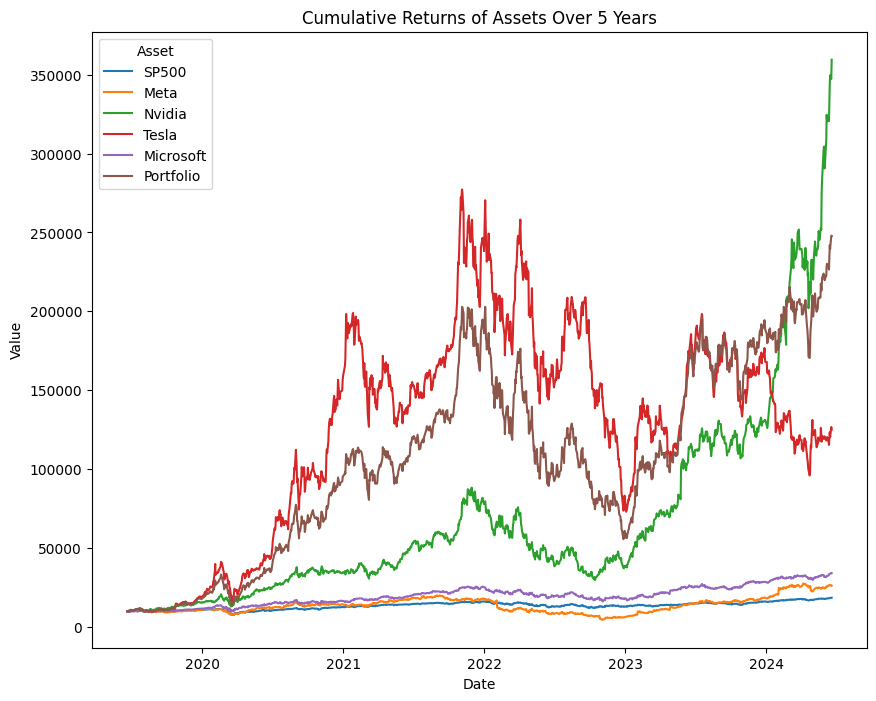
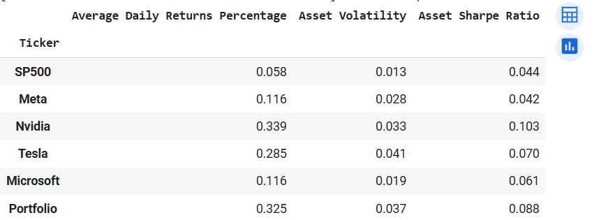
So with these functions in place, we can analyze several assets at a time. Let us take a few combinations of assets and weights. Taking S&P 500, Meta, Nvidia, Tesla, and Microsoft. Weights are 20% each over a 5-year period and a hypothetical USD1000 for each security and a portfolio of the securities.
# Analysing with lineplot first
start = datetime.date.today() - datetime.timedelta(days=365 * 5)
end = datetime.date.today()
tickers_1 = {"^GSPC": "SP500", "META": "Meta", "NVDA": "Nvidia", "TSLA": "Tesla", "MSFT": "Microsoft"}
weights_1 = [0.2, 0.2, 0.2, 0.2, 0.2]
plotSecurities(start, end, tickers_1, weights_1, 10000)
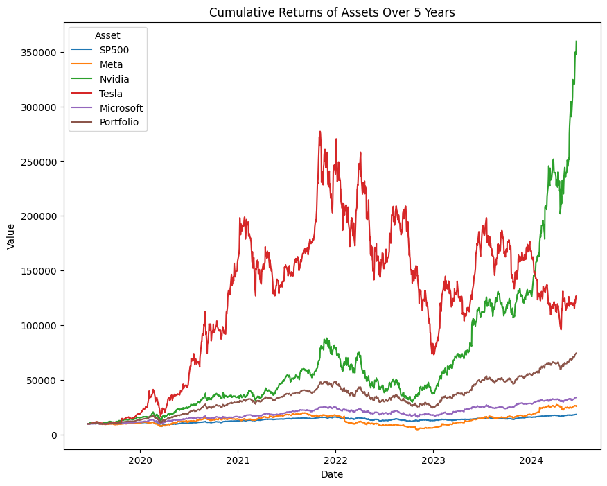
Output of plotSecurities(start, end, tickers_1, weights_1, 10000)
Nvidia's returns is looking like that of a cryptocurrency, LOL. From the diagram, the portfolio is the third-best-performing asset. Now let's check the volatility and Sharpe ratio.
# Analysis on returns, volatility and adjusted returns
start = datetime.date.today() - datetime.timedelta(days=365 * 5)
end = datetime.date.today()
tickers_1 = {"^GSPC": "SP500", "META": "Meta", "NVDA": "Nvidia", "TSLA": "Tesla", "MSFT": "Microsoft"}
weights_1 = [0.2, 0.2, 0.2, 0.2, 0.2]
comparePerfPort(start, end, tickers_1, weights_1)
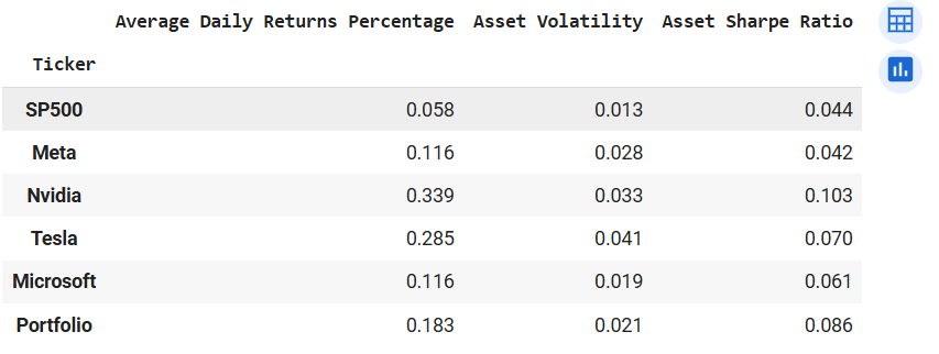
Output of comparePerfPort(start, end, tickers_1, weights_1)
Again we see our portfolio recording the second-highest risk-to-reward ratio (Sharpe Ratio). Also, the portfolio chalked greater daily returns than Meta but is much less volatile. In view of this knowledge, it would be prudent to increase the weight of Nvidia's investment, and reduce the weight of the other securities, especially Tesla. Tesla because it recorded a very high volatility measure given that the return is much smaller than Nvidia. Now lets change the weights to 30% for Nvidia, 16% for Tesla and 18% for the rest.
# Analysing with lineplot first
start = datetime.date.today() - datetime.timedelta(days=365 * 5)
end = datetime.date.today()
tickers_1 = {"^GSPC": "SP500", "META": "Meta", "NVDA": "Nvidia", "TSLA": "Tesla", "MSFT": "Microsoft"}
weights_2 = [0.18, 0.18, 0.3, 0.6, 0.18]
plotSecurities(start, end, tickers_1, weights_2, 10000)
Output of plotSecurities(start, end, tickers_1, weights_2, 10000) after weights adjustment
In the visual we see the portfolio doing better than all the assets expect Nvidia. Lets check the volatility analysis.
# Analysing with lineplot first
start = datetime.date.today() - datetime.timedelta(days=365 * 5)
end = datetime.date.today()
tickers_1 = {"^GSPC": "SP500", "META": "Meta", "NVDA": "Nvidia", "TSLA": "Tesla", "MSFT": "Microsoft"}
weights_2 = [0.18, 0.18, 0.3, 0.6, 0.18]
comparePerfPort(start, end, tickers_1, weights_2)
Output of comparePerfPort(start, end, tickers_1, weights_2) after weights adjustment
We see the portfolio performing better than all the other securities except Nvidia. This is for all the available metrics. The portfolio records better average daily returns than Tesla but has lower volatility. Also, the Sharpe Ratio is better than that of all the securities except Nvidia.
In this post we have learnt how to pull data into Jupyter Notebook and run analysis on financial data. We figured out how to calculate returns on a security, calculate volatility and how effective diversification can be profitable in the long-run. Thank you for your time and I would be posting more soon, so stay tuned. You can get thecode from my Colab.